
Meet CRAi™
Your CRA Analyst.

Based on 80,000+ Community Reinvestment Act performance evaluations and a growing set of 25+ public data sources. You ask the questions. CRAi returns consumable, relevant, evidenced results.

Key views for CRA and community development teams.

Every view works under today’s CRA rules and can be configured for the new proposed rules.

Performance Scorecard

See where you stand against peers and the market. Compare custom and standard data points across every test type.

Investment test scorecard with peer medians and written analysis

Geographic Insights

Surface trends at any level, from a single county to the whole country, with map overlays, charts, and narrative analyses.

Geography Explorer lending view with tract map and trend charts

Peer Benchmarking

Compare your institution to relevant peers - filter by asset tier, branch count, footprint, charter type, and CRA test ratings, or start from a recommended set and adjust.

Peer set configurator with saved sets and institution filters

Strategic Plan & Custom Goals

Set custom goals for strategic plans and other needs, let us process the data, and track both snapshot and trending performance for every goal.

Strategic plan goal readout with performance trends and a loan-geography map overlay

See CRAi in action.

Pick a bank to see a preview of assessment areas, sample LMI lending metrics, and peer comparisons. The free index covers banks that reported 2024 HMDA mortgage data; the platform covers every FDIC-insured bank. This is a small subset of the data CRAi holds about each bank and market.

CRAi™

Or try a demo bank:

Enhance your insights by combining structured public data with your private data.

CRAi starts with an expansive set of public data sources, already combined and analyzed. Layer in your own data and workflows when you’re ready.

Public Baseline

Start with publicly available, comprehensive, analyzed data

  • Every public evaluation on record in one searchable index
  • Performance views across lending, service, investment, and community development
  • Peer sets, opportunities, and rating context drawn from more than 35 years of exams

Private Data

Update with your data to add trends and insights

  • Benchmarks run on your own data across lending, deposits, investments, and branches
  • Goals set against peer and market evidence or on your own terms
  • Progress measured against those goals on whatever schedule you choose

Your data is your data. It is used only for your analyses, it is never used to train models, and it sits in your own isolated instance under SOC 2 Type 2 controls. How do we protect your data?

Customization

Add custom attributes and workflows to answer deeper questions

  • New attributes added to your data and new views built around them
  • Strategic-plan measures tracked in the same views
  • Every view keeps its evidence trail

Coming soonDescribe the question and CRAi assembles the workflow: it identifies the data it needs, asks you for what only you have, and sources the rest from the market.

We analyzed 80,000+ CRA exam records across more than 35 years. Here’s what we found.

We took the public CRA record back to 1990 and joined it to component scores and bank financials. Across the findings, one pattern recurs: CRA outcomes are shaped not only by what a bank does, but by its size, its market, and how deliberately it directs and documents qualifying activity.

The CRAi Insights Report · 2026

01 · The largest banks are ten times as likely to be rated Outstanding.

Share of exams rated Outstanding · asset bands in $B, plus SP/W-LP exam types · exams since 2017

Outstanding rate by asset size, plus the SP/W-LP exam types 7.2% 9.8% 17.8% 22.9% 31.8% 38.7% 76.6% 48.1% Small ISB <5 5–10 10–25 25–100 100+ SP/W-LP
Outstanding rate by asset bandstrategic-plan and wholesale exams

A small bank reaches Outstanding about 7% of the time. Over $100B: about 77%. Strategic-plan and wholesale banks run their own track: 48%.

The CRAi Insights Report · 2026

02 · Lower-income borrowers face the largest lending disparities in expensive urban markets, along the southern border, and in the farm valleys. The gaps are smallest across much of the Midwest.

Lending to lower-income borrowers vs. the share of lower-income families · every US county · 2024 mortgage originations
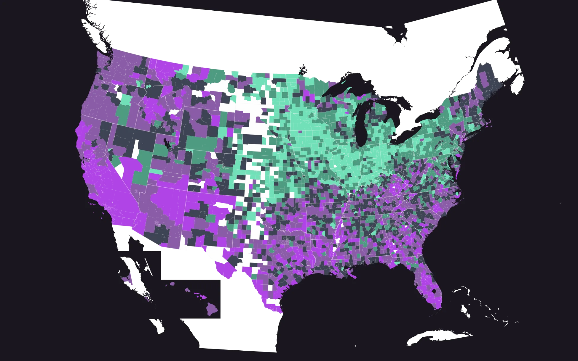
US county map of the gap between the share of families that are lower-income and the share of 2024 mortgages going to lower-income borrowers. Gaps run widest in expensive urban markets, along the southern border and through the farm valleys, and narrowest across much of the Midwest. Counties with fewer than 25 originations carry no value.
more than 10 points wider than the median3 to 10 points wider than the medianwithin 3 points of the median3 to 10 points narrower than the medianmore than 10 points narrower than the mediantoo few loans to measure (under 25)

Nationally, 39% of American families are lower-income, but only about 25% of 2024 mortgage originations went to a lower-income borrower—a 14-point gap. In the median county, lending to lower-income borrowers runs about 12 percentage points below their share of local families.

These insights are based on public data sets which may contain errors. If you notice an error or would like to send us feedback, please email CRAi@fairplay.ai.